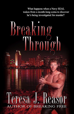
Which cover do you like?

I have a dilemma. My cover artist Tracy Stewart did two different covers for my print edition of Breaking Through. I need your help in deciding which to use. So, please vote for cover 1 or cover 2 and let me know. Cover 1 Cover 2 I know there isn't much difference between them. The differences are the placement of the tag line. the second cover has more red in the background and the image is a little larger. I'd really like to hear your opinion. Teresa R.